Paste Design System Newsletter - January 2023 Edition
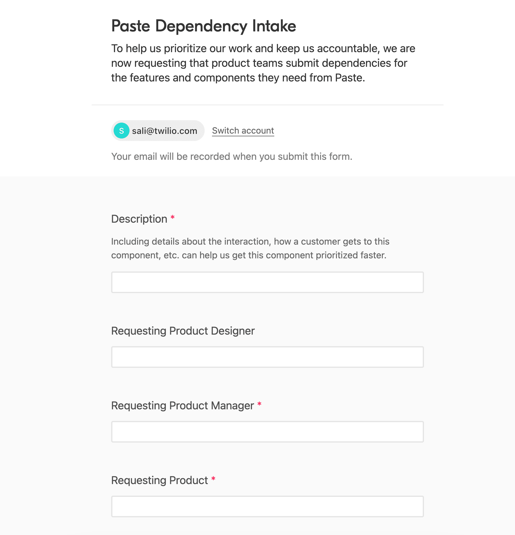
To help us prioritize our work and keep us accountable, we now have an Airtable form that you and your team can use to submit dependencies for the features and components you need from us.
We factor your requests directly into our roadmap planning, so submit a request today to help us better understand your needs!
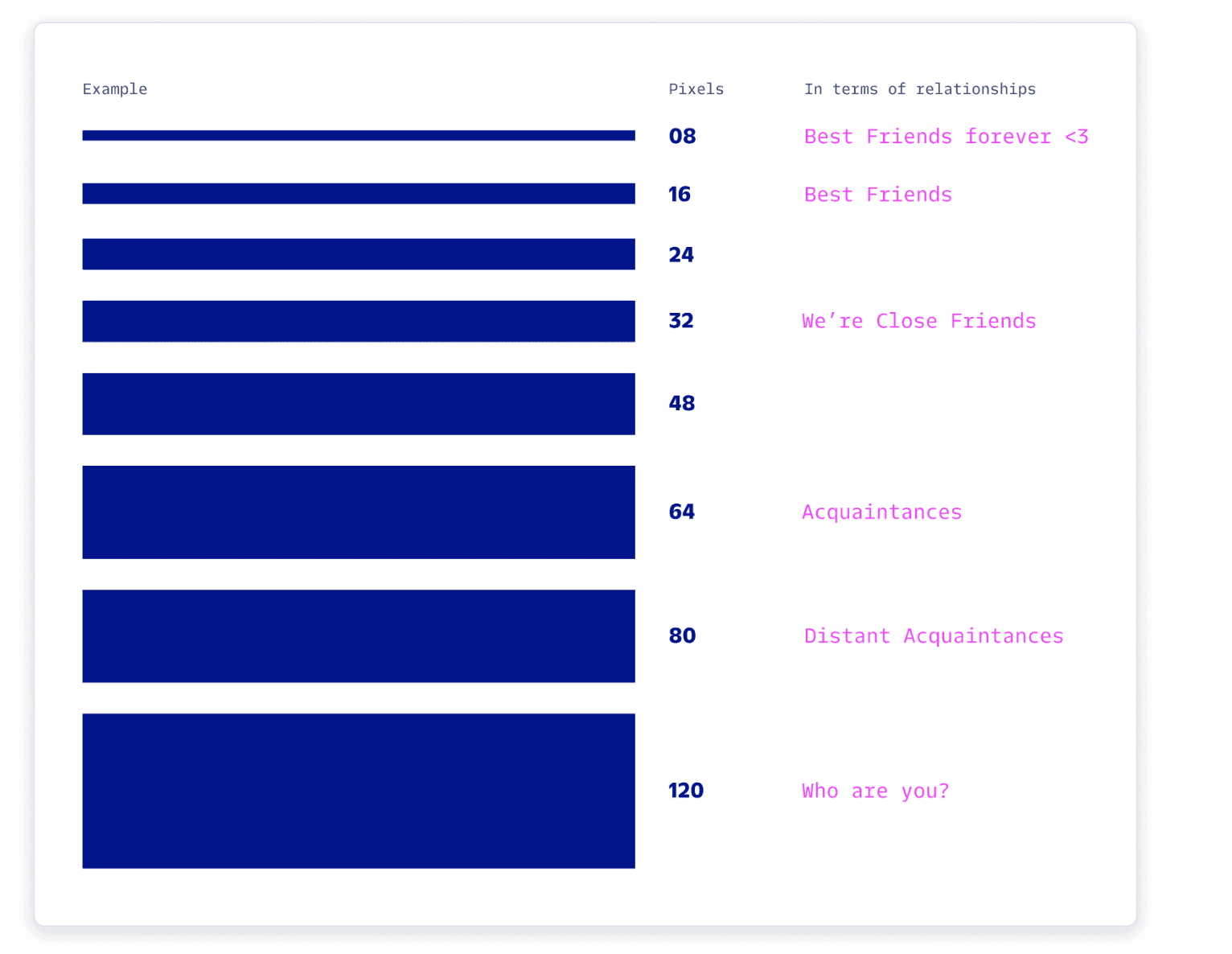
Want to learn more about spacing and hierarchy within your flows? Then these spacing and layout guidelines are for you! This foundational page breaks down the importance of creating visual relationships with your elements.
Check out the Spacing and Layout foundations documentation
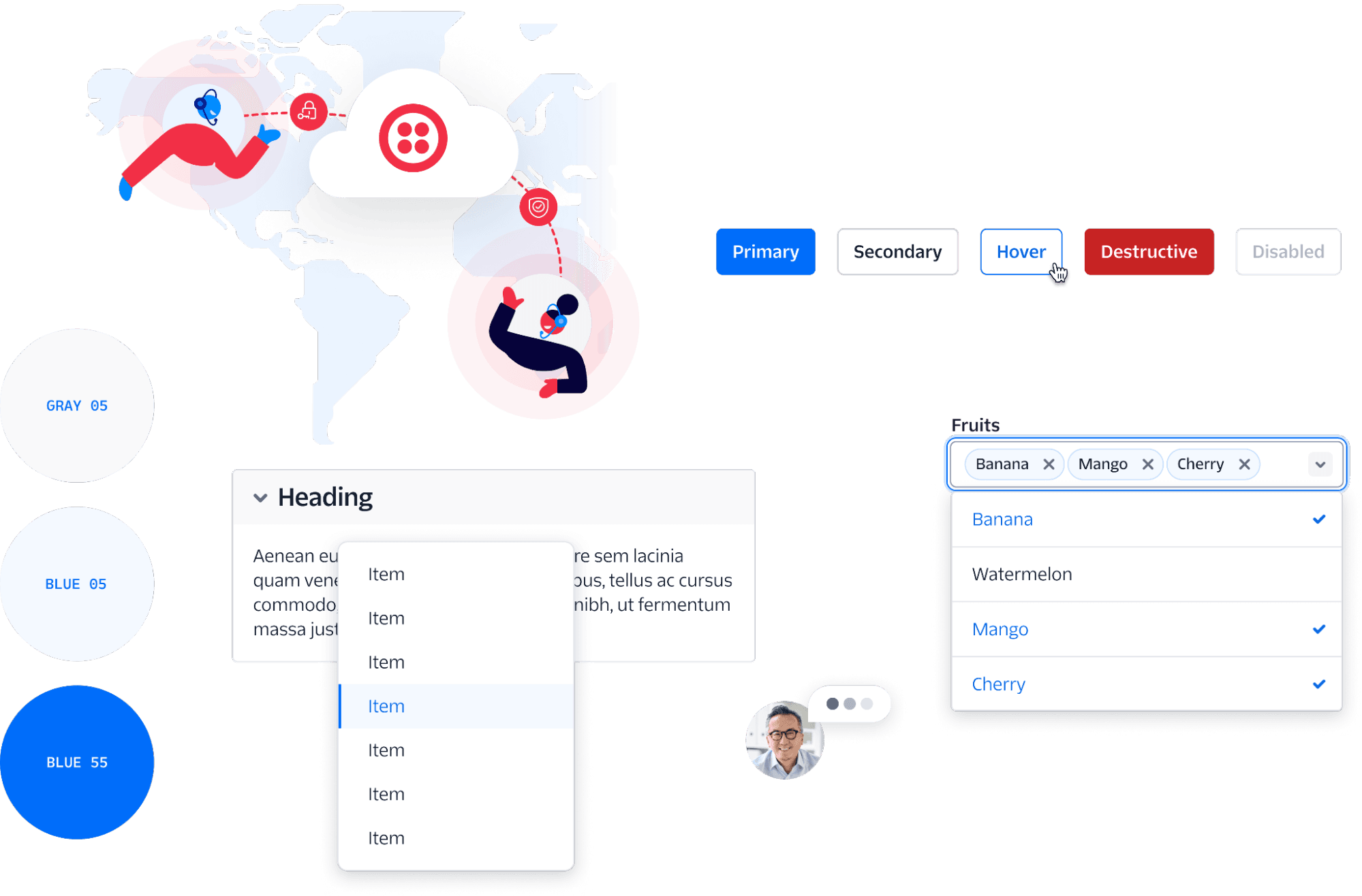
We are excited to announce the new design language is live in Figma! This update comes from the One Twilio initiative to create a cohesive design language to unify Twilio’s product suite. Learn more about the work on the Twilio Blog: “Bringing Cohesion to the Twilio Product Suite.”
Stay tuned for more news about this design language update and what product teams can expect over this year. If you have any questions about implementing in the meantime, please refer to the Twilio Theme: Design Language Updates Guide.

As product builders, we are constantly trying to find ways to organize our content within a layout that feels digestible and manageable. We want our customers to be able to quickly find the right information they need to make decisions. We now have a component that helps with organizing lots of pieces of small information at once, the Description List!
Check out the Description List
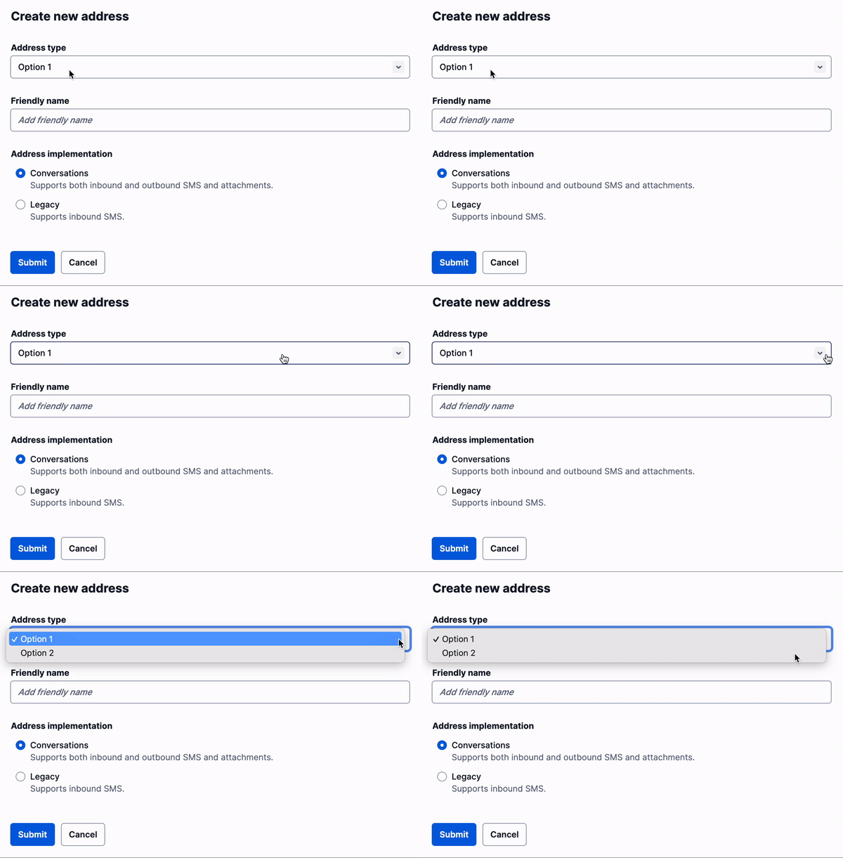
A Form groups related form elements that allow users to input information or configure options. This component package enhances the HTML form element with preset spacing, so forms remain visually consistent across different pages.
Take a look at the Form component
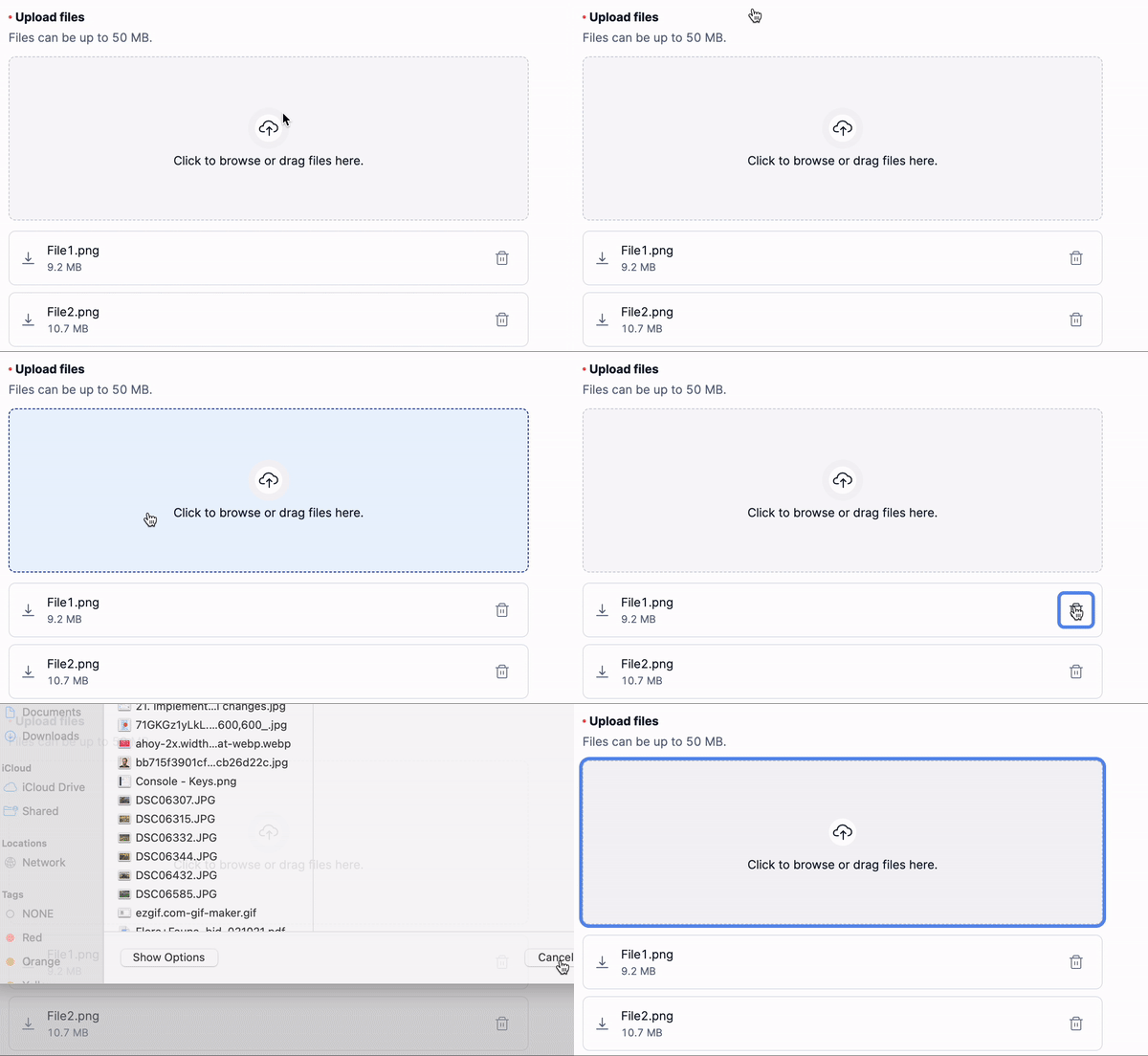
The File Uploader is a visually enhanced form element that is used to upload multiple attachments. It is fully accessible and supports dragging-and-dropping attachments.
Learn more about File Uploader here
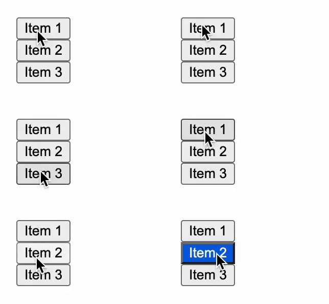
The Listbox Primitive is a component used to create accessible Listboxes that can be styled to create interactive, list-based components.Listboxes can also be used in any situation where a user needs to select items in a list or rearrange a list.
Check out other examples here!
Conversations UI Kit: The Paste team has been working on something big for the past year: the Conversations UI Kit! It is a set of React components and Figma design assets that make building a chat experience a breeze.
Added ProductUSSDIcon and Segment product icons with the help from Brandon Templar from Segment!
New icons include:
- ProductAudiencesIcon
- ProductConnectionsIcon
- ProductEngageIcon
- ProductPersonasIcon
- ProductPrivacyIcon
- ProductProtocolsIcon
- ProductReverseETLIcon
- ProductTraitsIcon
- ProductUSSDIcon

In this edition of Pastemates, we're spotlighting a mate from Twilio Brand, Nathan Sharp! Nathan has been such a huge support with our One Twilio efforts, and we’d like to say thanks! We’re truly grateful for our relationship with the Brand team and excited about what we will collab on next!
Nathan and the brand team have been instrumental to our One Twilio project, an initiative to evolve the product design language in order to give our customers a cohesive experience across all products.
Not only did we work across product teams to land on this design language, but it was really essential to have a close relationship with Brand, so we could ensure we were being true to Twilio’s personality.
Marketing energizes customers and invites them in, while product UI reassures customers that we’re here every step of the way to make their experience seamless.
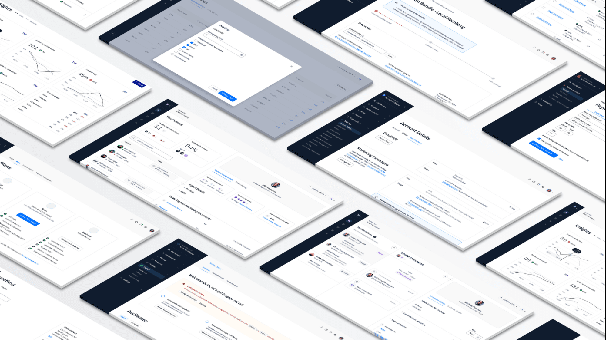
Finding that balance can be a tricky endeavor. However, with Nathan’s help, we were able to keep the brand personality that makes us, well, us. We started using our new super family typeface, Twilio Sans, and also collaborated on lighter color hues, thoughtful brand moments to celebrate success, more negative space, and other visual elements, to give designers tools to set a customer up for success.
We're stoked that Nathan and team were able to work with us on this initiative! If you would like to hear more about the Twilio Sans brand story, check out Nathan's blog post!
We have just created a new theme of Paste that all products using Paste can use starting later this year. If you or your teams have questions, please feel free to reach out on GitHub Discussions and check out the Twilio Design Language Updates Guide.
The UX Infrastructure team is moving to an OKR format for tracking our goals and projects. Below are our OKRs for Q1 of 2023:| Objective | Key Results |
|---|---|
| Establish Paste as the standard UI framework for Segment, and unify Twilio customer experiences in a single, beautiful Design Language update. R&D Shared Goal: One Identity, One Invoice |
|
| Drive reliability, resiliency, and quality in Twilio products through investments in infrastructure R&D Shared Goal: Reliability First |
|
| Establish the foundations for best in class product and visual design at Twilio R&D Shared Goal: One Identity, One Invoice |
|
| Feature | Description |
|---|---|
| Evergreen theme | Establish Paste as the standard UI framework for Segment by creating a Segment theme, so it's easier to implement Paste for other phases of work. |
| Typography guidelines | Guidelines for using typography and how to better establish hierarchy within Twilio products. |
| Tabs component, refined | This update to Tabs refines the design to create distinct visual hierarchy within a page for tabbed content and when paired with the In Page Navigation component. |
| Popover component, refined | This update to Popover includes improved documentation. |
| Detail Text | Detail Text is a typography component used for small, short pieces of secondary text content. |
| CSAT survey | Look out for our biannual survey to check in on your satisfaction with using Paste. |
As always, we’re better together.
— The UX Infrastructure Team